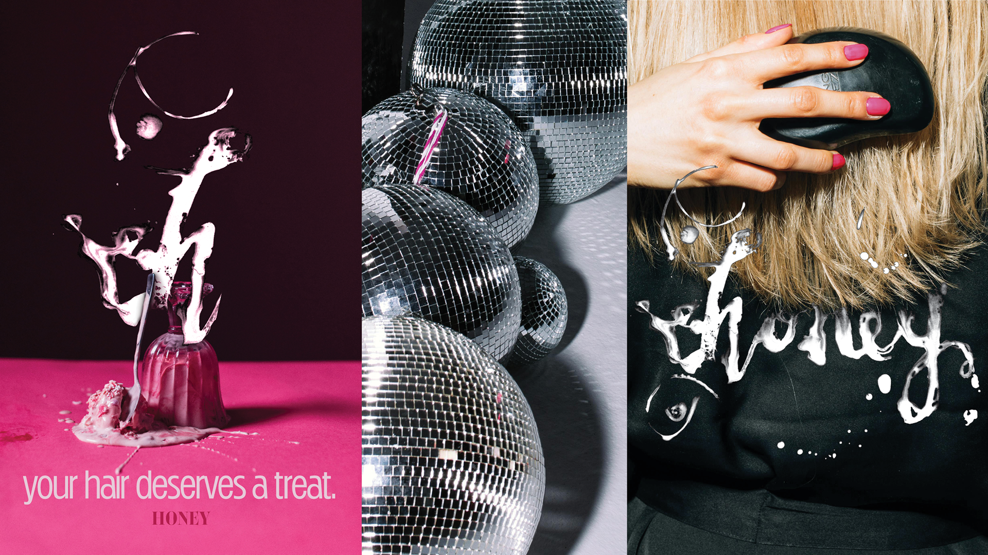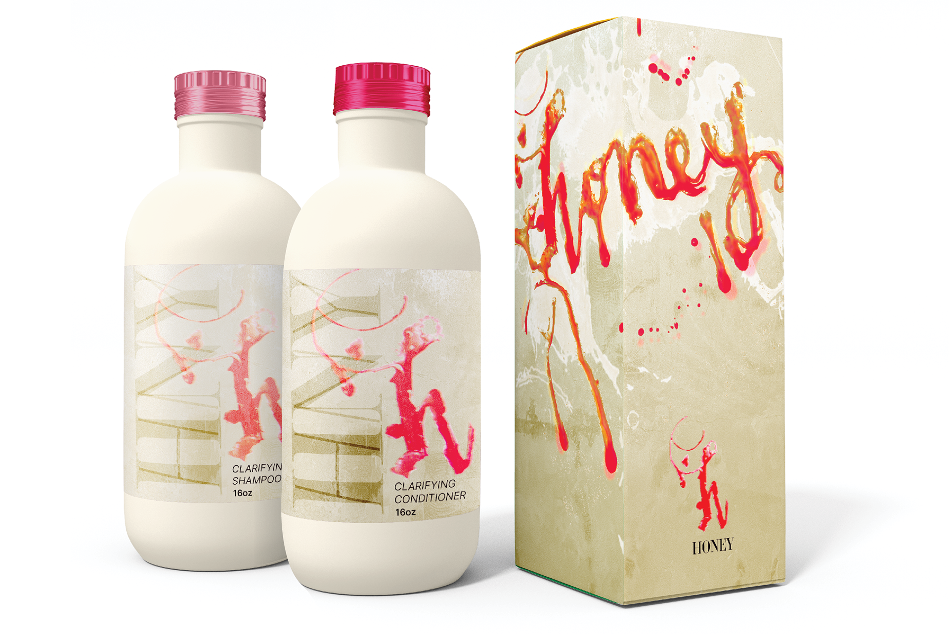

HONEY
IDENTITY, PACKAGING, HAND TYPE, SOCIAL MEDIA
IDENTITY, PACKAGING, HAND TYPE, SOCIAL MEDIA
Playful with gravitas
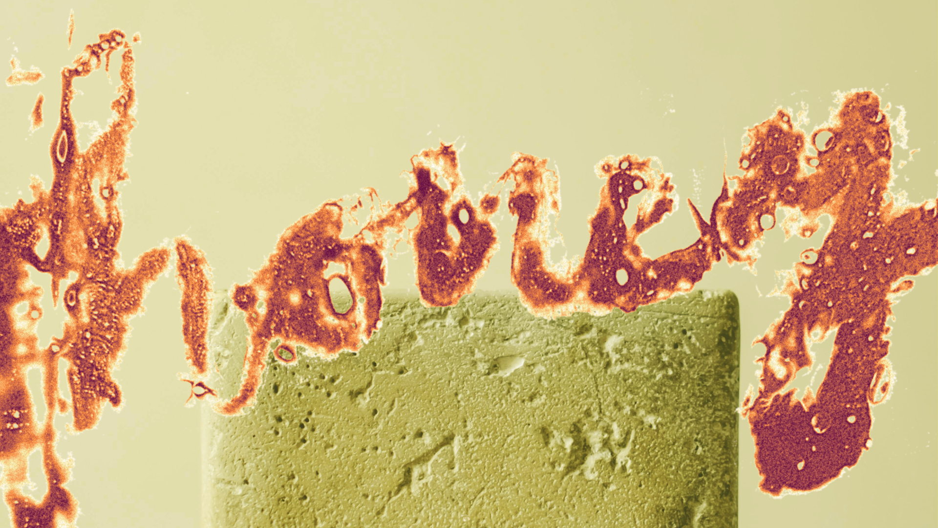
How do you make a lighthearted appeal to a younger audience without losing brand credibility? Honey balances tensions between rawness and refinement, playful maximalism and industrial restraint. Liquid typography, done by hand and stretched to its limits with wild color, pairs with minimal serif elements and a warm neutral base.
Variations of Honey, HNY, or just "h" are used interchangeably to imply history and suggest craft over mass production. The packaging's clinical forms paired with gritty textures and vibrant splashes let a bold, unfussy attitude shine while preserving the professional grounding of a reputable brand. The result is a visual system that feels more like a limited-edition drop than a shampoo.