ORLANDO
LOGO, VISUAL IDENTITY, BRAND GUIDELINES
LOGO, VISUAL IDENTITY, BRAND GUIDELINES
How do you show magic?
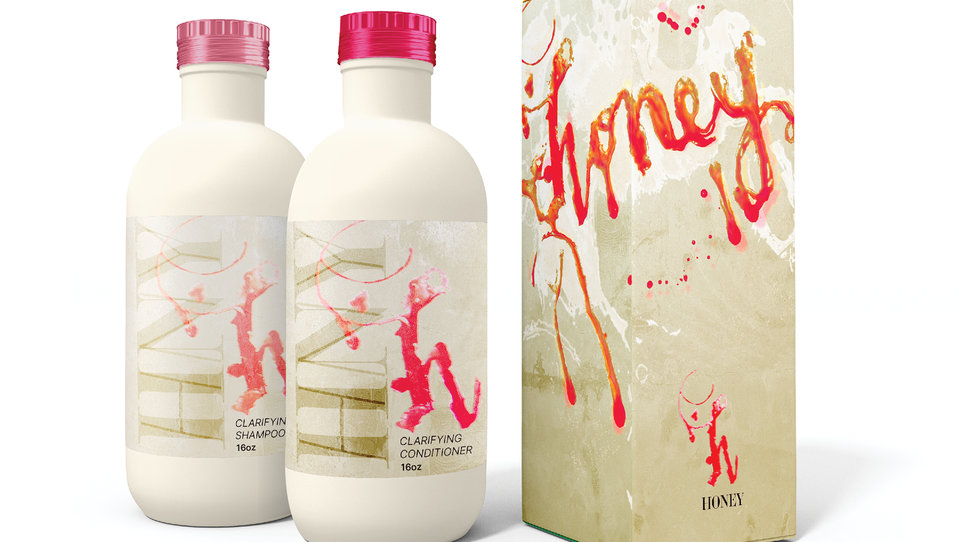
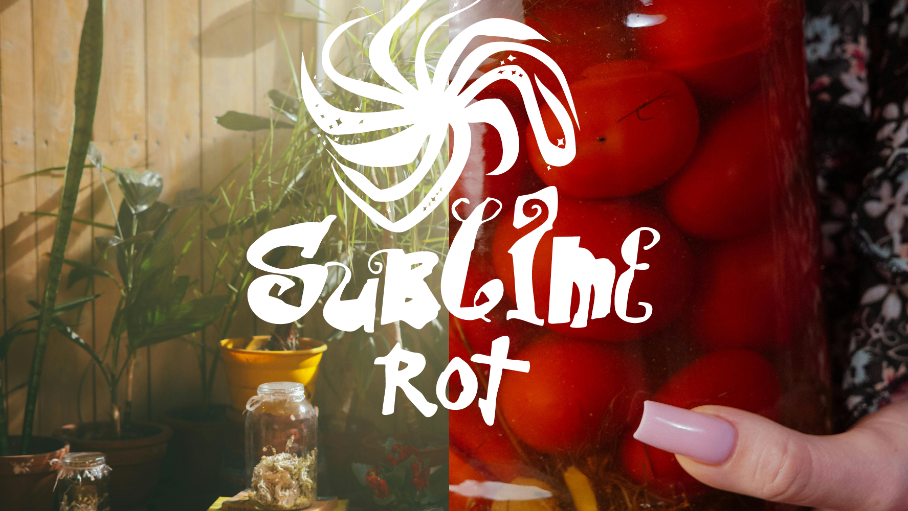
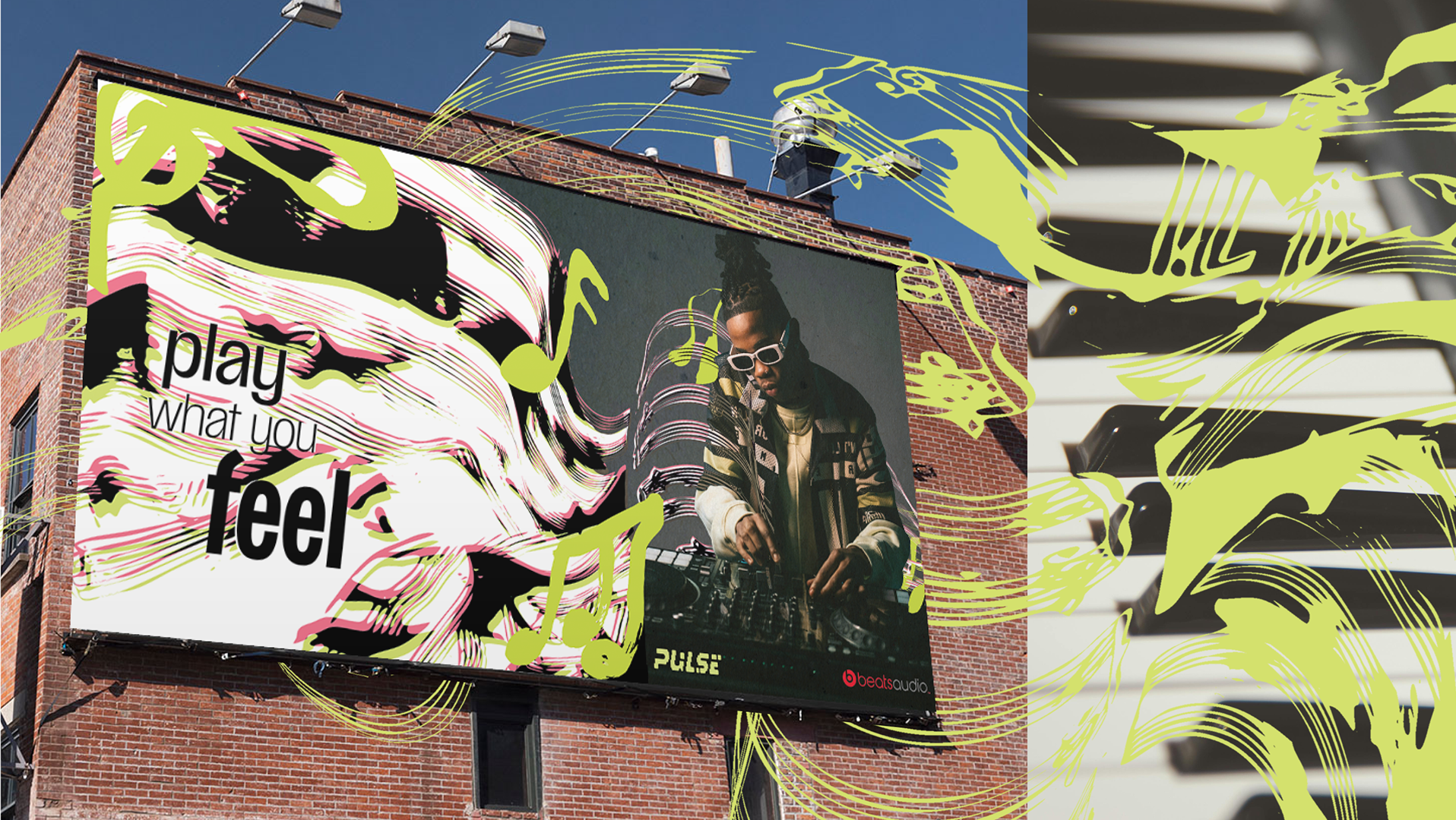
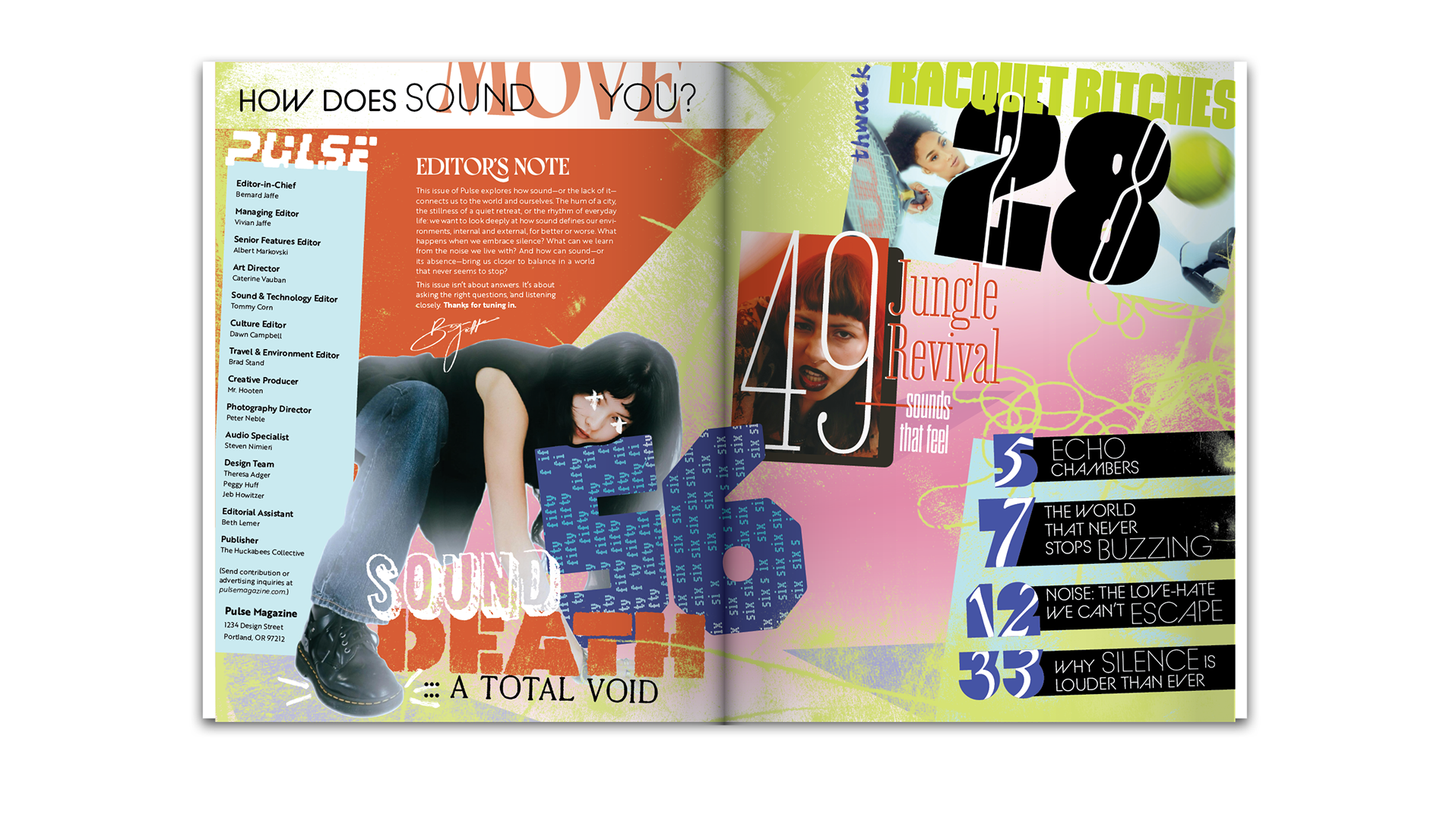
Orlando gets repositioned as a romantic destination for discerning millennial moms seeking meaningful family experiences. The visual system blends vintage Florida kitsch, Southern mystique, and contemporary family-friendly design.
Typography nods to fairytales and vintage film title cards, while remaining grounded and contemporary. Layout divisions, color floods, dotted lines, and positive-negative cutouts work together to balance presence and absence—inviting the viewer to imagine themselves within the story. The result is a cinematic and flexible identity system that’s ready to grow with the city’s future.
PROCESS

